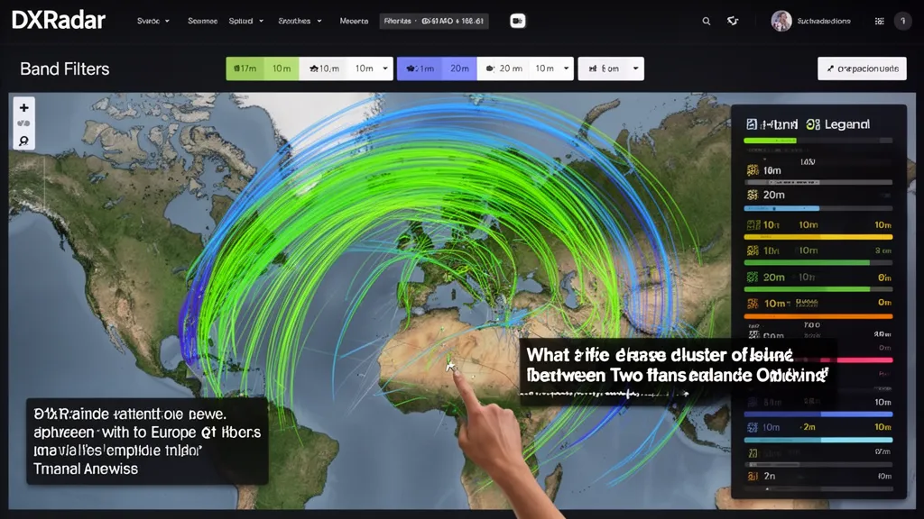
Operator's Verdict: Lines = reported contacts; colour = frequency band; brightness = recency. Dense lines between two regions mean the band is open between them right now. No lines = closed or quiet. Check DXRadar's map before operating — 2 minutes of observation tells you more than any propagation forecast.
What the Map Is Actually Showing
A radio propagation map is a real-time picture of ionospheric activity drawn by thousands of amateur radio operators worldwide, most of whom have no idea they're contributing. Every FT8 digital radio contact automatically reports to PSKReporter — a global database that records who heard whom, at what frequency, and at what time.
DXRadar's propagation map draws lines between these reporter stations, with:
- Line endpoints: The locations of the transmitting and receiving station
- Line colour: The frequency band (see colour key in the interface)
- Line brightness: How recently the spot was reported (bright = within minutes; faded = 30+ minutes old)
The result is a continuously updating picture of ionospheric propagation as it actually exists, not as a model predicts it.
Pro Tip: Monitor DXRadar's solar weather dashboard for real-time space weather data — check it before every operating session.
Reading the Map: Step by Step
Step 1: Choose your band
Use the band filter to select a specific frequency range. Start with all bands to see the global picture, then narrow to your band of interest.
When all bands are shown simultaneously, you'll typically see:
- Lots of activity on 20m and 40m (these are open nearly 24/7 in some direction)
- Less activity on 10m (depends heavily on solar conditions)
- Occasional VHF (50 MHz, 144 MHz) spots indicating Es or other VHF propagation
Step 2: Identify active regions
Look for clusters of lines between specific geographic regions. Lots of lines crossing the North Atlantic between North America and Europe means transatlantic propagation is active. Lines from Japan to California mean the transpacific path is open.
Absence of lines is equally informative — if no spots appear between your region and the target region, the band is closed or the path requires marginal conditions.
Step 3: Spot age matters
A map full of faded (old) spots with no fresh bright lines means propagation was good recently but may have closed. Before acting on the map, filter for recent spots only (last 15–30 minutes) to confirm conditions are current.
Step 4: Use the band-specific views
DXRadar's individual band pages (/band/10m, /band/20m, etc.) show the propagation map filtered to that band along with solar index data relevant to that specific frequency. This is the most efficient view for deciding whether to operate a specific band.
Understanding Spot Density
| What you see | What it means |
|---|---|
| Dense lines crossing Atlantic on 10m | 10m is open transatlantically — get on now |
| Lines from your region on 20m, none on 10m | 20m is open; 10m is closed from your area |
| No lines at all in your region | Low solar activity, time of night, or equipment/software issue |
| Lines only going north-south, not east-west | Auroral or polar propagation; E-W paths may be disrupted |
| Single line from distant DX station | That path is working; may be brief opening |
The Role of PSKReporter vs. DX Cluster
PSKReporter feeds the map automatically. As long as operators run WSJT-X with internet reporting enabled (the default), every FT8/FT4 decode feeds PSKReporter. This produces a dense, continuous picture of propagation.
DX cluster spots represent human-observed contacts, often including:
- CW contacts (CW operators rarely run automated reporting)
- SSB voice DX contacts
- Rare DX stations that are specifically sought
DXRadar integrates both data sources. The automated PSKReporter data provides the background propagation picture; the DX cluster overlays rare DX station activity.
What the Map Doesn't Show
CW and SSB activity: Most CW and SSB contacts are not automatically reported. A busy 20m SSB pileup may not appear on the map at all. PSKReporter is nearly entirely driven by FT8/digital mode contacts.
Your local noise floor: The map shows global activity. If your antenna is compromised or local noise is high, the band may show as "open" on the map but you personally cannot hear signals.
Short-term propagation quality: A single spot represents one contact at one moment. The map cannot tell you whether a path will be open in 30 minutes.
Very short paths: Stations within 500 km rarely appear on propagation maps because most digital operators are looking for DX contacts, not local ones.
Practical Use: Before Every Operating Session
- Open DXRadar's propagation map (or best-bands-now for a summarised view)
- Check "all bands" for a global picture — which continents are connected to each other?
- Filter to your target band
- Look for spots from your region toward your target region
- If spots exist, the band is likely open — tune up and listen
- If no spots exist from your region, check adjacent frequencies or try a different band
This 2-minute check before every operating session replaces hours of guesswork. The map is the most direct possible evidence of current propagation conditions — it's the sum of thousands of real observations happening right now.
Frequently Asked Questions
What does a radio propagation map show?
A radio propagation map displays real-time (or near-real-time) information about which radio bands are currently open and where DX contacts are being made. The main data source is reception reports from digital mode operators (FT8, FT4, JS8) feeding into PSKReporter, and manually submitted spots to the DX cluster network. Lines drawn between two points show that a station at one location was heard or worked by a station at the other location. The colour of lines typically indicates frequency band (green = 10m, blue = 20m, etc.). The density of lines between regions indicates how active propagation is on that path.
What do the different colours on a propagation map mean?
Colour coding varies by map provider, but the standard convention is: red/orange lines = low HF bands (80m, 40m); yellow = 30m/20m; green = 17m/15m; blue = 12m/10m; purple = 6m VHF; grey = faded/old spots. On DXRadar, the colour intensity also indicates spot age — brighter lines are more recent spots, faded lines are older. The band filter controls which frequencies are displayed. When you select '10m' view, only 28 MHz spots appear, immediately showing where 10m is open globally.
What is the difference between a PSKReporter map and a DX cluster map?
PSKReporter collects automated reception reports from FT8/FT4/JS8 digital mode software. Every time your radio decodes a digital signal, it automatically reports it to PSKReporter — no manual action required. This produces a continuous, dense dataset of propagation events. The DX cluster collects manually submitted spots — a human operator hears a DX station and manually posts a spot with callsign and frequency. DX cluster spots are less frequent but often contain CW and SSB contacts that automated systems miss. A complete picture uses both: PSKReporter for propagation mapping, DX cluster for real-time DX activity.
How do I use a propagation map to decide what band to operate?
Look at the map with 'all bands' or your target band selected. If you see many lines connecting North America to Europe on 10m, that band is open for transatlantic contacts right now. If those lines disappear on 10m but remain on 20m, 20m is the current transatlantic band. If no lines appear in your region at all, the band is likely closed or very poor. This is more reliable than trying to calculate propagation from solar indices alone — the map shows direct observational evidence of what frequencies are working between specific regions at this moment.
What is a Maidenhead grid square and why is it on propagation maps?
The Maidenhead Locator System divides Earth into a grid of rectangles identified by a 4-character code (e.g., IO91 for London area). Amateur radio uses grid squares as a geographic identifier that fits neatly in contest exchanges and DX spot records. Propagation maps use grid squares to plot station locations — a spot showing '21.074 MHz — K4ABC → G4XYZ' indicates a contact between the US (K prefix) and UK (G prefix) on the 15m digital sub-band. When multiple spots appear between the same grid square regions, it confirms an active band opening between those geographic areas.